Amber is not only a color, but has its own physical form. You can hold amber in your hand, and glide over its soft glass-like edges. There is something special about being able to hold a color in its elemental form. Mauve can’t be held, on the other hand, but there is something special about a color steeped in a history of power. I can’t decide if I like the the feel of the word Mauve as it crosses over my tongue, and through my lips; how the “v” must be accentuated when you’re already over the word in your mind. This begs the question, are we over Mauve before we even finish calling it by it’s name? Well I’m here to argue that Mauve deserves a fighting chance. Beyond being worthy of our attention, I think these colors have the potential to be quite a striking color couple.
Perhaps you already feel the love for this duo, or maybe you are wondering what in the world these two have in common. Well, it’s not so much what’s in common, as how these colors can compliment one another. However, before we start doling out compliments let’s take a closer look at these colors, and their unique histories.
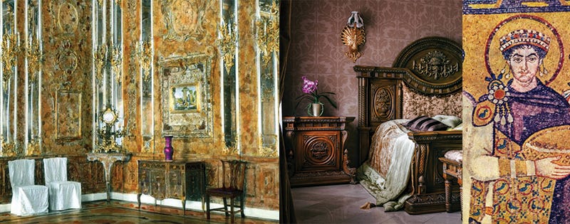
Amber has ancient roots. The material derives from resin born from tree species that are now long extinct. It’s a color that predates humanity, and can reference a range of tones in the yellow to orange color wheel. I think the most notable use of Amber in design is the infamous Amber Room that was a gift to Peter the Great in 1716. This room disappeared during World War II, and the mystery that shrouds its past intensifies its intrigue. In my mind Amber evokes warm sun, french antique rosewood furniture, orange wine, and rolling fires. It’s a golden glow that feels bright yet rich.

Mauve has much younger origins. Discovered on accident by Sir William Perkins in 1856, the color was often referred to as Perkins Purple. A shade of purple, Mauve contains more gray and more blue than a pale tint of magenta, and is sometimes described as pale violet. It was the height of fashion in the Victorian times. Most notably perhaps was Queen Victoria, who had a dress made of rich Mauve velvet for the occasion of her daughter’s wedding. Purple has long been associated with Royalty, as a color of power. As illustrated above the color was associated with Emperors dating back to Byzantine times, and earlier. A color that was hard to produce prior to Perkin’s discovery, and a rarity in nature, it’s clear why Mauve was so highly esteemed. Shall we see what a little Amber Mauve cocktail can produce?
As illustrated above you can see textures in these hues, including one of my favorite Maharam textiles ‘Wool Check by Paul Smith” in Poppy. This modernist check unites Mauve and Amber in a wonderful melange of colors. These two are complementary by definition, but they are not quite so to the eye. One could go all in Amber, if Peter the Great’s marvel is calling, but adding Amber into a space through light play and furnishings is more appealing. From a pop of Amber that churns from a rolling fire, to the light that pours through Amber stained glass to warm a room, Amber always adds a fiery warmth that is almost tactile in nature.
Mauve walls are striking, but not for the faint of heart. If I were designing a space for myself, I might do a nice Mauve room with Amber floor to ceiling curtains, utilizing more neutral finishes and furnishings to allow the colors to play nicely. I would add accents in the form of textiles, or decor elements, to bring the many hues of Amber and Mauve into the scene. Perhaps an Amber vase or Amber toned wood side table. Maybe a Mauve and Amber striped blanket, or vintage chairs with reupholstered Mauve seat cushions. The options are endless.
Do you want to feel royal, or has purple always been your power color? Well here are some paint colors to play with if you dare: Mauve Mist by Benjamin Moore is sure to make an impression, and if you aren’t feeling so bold, Peignoir by Farrow & Ball is a stunner. To get that Amber glow Amber by Benjamin Moore is a no brainer, and Sand by Farrow & Ball is sure to brighten your space. Play with one, play with none, but I hope at the very least you learned something about this color power couple. If you would like to see more examples of how to collide these colors, check out my color collision pinterest board.
I hope you found a new affection, maybe even an infliction, for these captivating colors. Feeling inspired but don’t know where to start? Perhaps you need some guidance or permission to play with color. Whatever the case may be, feel free to reach out to me at Katie Kennedy Interiors. I’d love to collaborate with you, and as you might have guessed, I could color play all day.
Until we collide again…
Xx
Katie


